Table of Contents
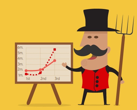 |
With the Chartist Behavior extension for the Haddock Template you can convert regular wiki tables into stunning charts.
How does it work ?#
Put %%chartist-XXX around one or more tables. Each table will be converted to a Line-, Bar- or Pie-Chart. The table headers are automatically converted into the chart labels, and the other table rows become the chart data-series.You can override the default settings of your charts by passing in a configuration object as first item. (eg: hight, width, axis parameters, etc.)
Supported chart types: %%chartist-line, %%chartist-bar or %%chartist-pie.
Basic use#
%%chartist-line {
  high: 15,
  low: -5
}
|| Monday || Tuesday || Wednesday || Thursday || Friday
| 12| 9 | 7  | 8 |  5
| 2 | 1 | 3.5| 7 |  3
| 1 | 3 | 4  | 5 |  6
/%
{ high: 15, low: -5 }
| Monday | Tuesday | Wednesday | Thursday | Friday |
|---|---|---|---|---|
| 12 | 9 | 7 | 8 | 5 |
| 2 | 1 | 3.5 | 7 | 3 |
| 1 | 3 | 4 | 5 | 6 |
Examples Line Charts#
Line Chart#
%%chartist-line {
  //width: '640px',
  high: 15,
  low: -10
}
|| Monday || Tuesday || Wednesday || Thursday || Friday
| 12| 9 | 7  | 8 |  5
| 2 | 1 | 3.5| 7 |  3
| 1 | 3 | 4  | 5 |  6
/%
{ //width: '640px', high: 15, low: -10 }
| Monday | Tuesday | Wednesday | Thursday | Friday |
|---|---|---|---|---|
| 12 | 9 | 7 | 8 | 5 |
| 2 | 1 | 3.5 | 7 | 3 |
| 1 | 3 | 4 | 5 | 6 |
Line chart with area#
This chart uses the showArea option to draw line, dots but also an area shape. Use the low option to specify a fixed lower bound that will make the area expand. You can also use the areaBase property to specify a data value that will be used to determine the area shape base position (this is 0 by default).
%%chartist-line {
  low: 0,
  showArea: true
}
|| 1 || 2 || 3 || 4 || 5 || 6 || 7 || 8
|  5 |  9 |  7 |  8 |  5 |  3 |  5 |  4
/%
{ low: 0, showArea: true }
| 1 | 2 | 3 | 4 | 5 | 6 | 7 | 8 |
|---|---|---|---|---|---|---|---|
| 5 | 9 | 7 | 8 | 5 | 3 | 5 | 4 |
Bi-polar Line chart with area#
You can also only draw the area shapes of the line chart. Area shapes will always be constructed around their areaBase (that can be configured in the options) which also allows you to draw nice bi-polar areas.
%%chartist-line {
  high: 3,
  low: -3,
  showArea: true,
  showLine: false,
  showPoint: false,
  fullWidth: true,
  axisX: {
    showLabel: false,
    showGrid: false
  }
}
|| 1 || 2 || 3 || 4 || 5 || 6 || 7 || 8
|  1 |  2 |  3 |  1 | -2 |  0 |  1 |  0
| -2 | -1 | -2 | -1 | -2.5 | -1 | -2 | -1
|  0 |  0 |  0 |  1 |  2 |2.5 |  2 |  1
|2.5 |  2 |  1 |0.5 |  1 |0.5 | -1 | -2.5
/%
{ high: 3, low: -3, showArea: true, showLine: false, showPoint: false, fullWidth: true, axisX: { showLabel: false, showGrid: false } }
| 1 | 2 | 3 | 4 | 5 | 6 | 7 | 8 |
|---|---|---|---|---|---|---|---|
| 1 | 2 | 3 | 1 | -2 | 0 | 1 | 0 |
| -2 | -1 | -2 | -1 | -2.5 | -1 | -2 | -1 |
| 0 | 0 | 0 | 1 | 2 | 2.5 | 2 | 1 |
| 2.5 | 2 | 1 | 0.5 | 1 | 0.5 | -1 | -2.5 |
Example Bar Charts#
Bar#
A bi-polar bar chart with a range limit set with low and high. There is also an interpolation function used to skip every odd grid line / label.
%%chartist-bar {
  high: 10,
  low: -10,
  axisX: {
    labelInterpolationFnc: function(value, index) {
      return index % 2 === 0 ? value : null;
    }
  },
  fullWidth: true,
  centerBars: false
}
||W1 ||  W2 ||  W3 ||  W4 ||  W5 ||  W6 ||  W7 ||  W8 ||  W9 ||  W10
|1  |  2  |  4  |  8  |  6  |  -2 |  -1 |  -4 |  -6 |  -2
/%
Overlapping bars#
This example makes use of label interpolation and the seriesBarDistance property that allows you to make bars overlap over each other.
%%chartist-bar {
  seriesBarDistance: 10
}
||Jan||Feb||Mar||Apr||Mai||Jun||Jul||Aug||Sep||Oct||Nov||Dec
|5| 4| 3| 7| 5| 10| 3| 4| 8| 10| 6| 8
|3| 2| 9| 5| 4| 6| 4| 6| 7| 8| 7| 4
/%
Stacked Bar Chart#
You can also set your bar chart to stack the series bars on top of each other easily by using the stackBars property in your configuration.
%%chartist-bar {
  stackBars: true,
  axisY: {
    labelInterpolationFnc: function(v) { return (v/1000) + 'k' }
  }
}
||Q1    ||Q2       ||Q3       ||Q4
|800000 |  1200000 |  1400000 |  1300000
|200000 |  400000  |  500000  |  300000
|100000 |  200000  |  400000  |  600000
/%
Bar chart with Multi-line labels#
Chartist will figure out if your browser supports foreignObject and it will use them to create labels that are based on regular HTML text elements. Multi-line and regular CSS styles are just two of many benefits while using foreignObjects.
%%chartist-bar {
  seriesBarDistance: 10,
  axisX: {
    offset: 60
  },
  axisY: {
    offset: 80,
    labelInterpolationFnc: function(value) {
      return value + ' CHF'
    },
    scaleMinSpace: 15
  }
}
||First quarter of the year||Second quarter of the year||Third quarter of the year||Fourth quarter of the year
|60000 |  40000 |  80000 |  70000
|40000 |  30000 |  70000 |  65000
|8000  |   3000 |  10000 |   6000
/%
Example Pie Charts#
Simple Pie Chart#
A very simple pie chart with label interpolation to show percentage instead of the actual data series value.
%%chartist-pie {
  labelInterpolationFnc: function(value, index){
    return Math.round( value / (5+3+4) * 100) + '%';
 }
}
| 5 | 3 | 4
/%
{ labelInterpolationFnc: function(value, index){ console.log("hi",value,index, labels, series); return Math.round( value / (5+3+4) * 100) + '%'; } }
| 5 | 3 | 4 |
Pie chart with custom labels#
This pie chart is configured with custom labels specified in the data object. On desktop we use the labelOffset property to offset the labels from the center. Also labelDirection can be used to control the direction in which the labels are expanding.
%%chartist-pie {
  labelInterpolationFnc: function(value){ return value; }
}
||Bananas||Apples||Grapes
|20| 15| 40
/%
{ labelInterpolationFnc: function(value){ return value; } }
| Bananas | Apples | Grapes |
|---|---|---|
| 20 | 15 | 40 |
Gauge chart (donut)#
This pie chart uses donut, startAngle and total to draw a gauge chart.
%%chartist-pie {
  donut: true,
  donutWidth: 60,
  startAngle: 270,
  total: 200,
  showLabel: false
}
|20| 10| 30| 40
/%
{ donut: true, donutWidth: 60, startAngle: 270, total: 200, showLabel: false }
| 20 | 10 | 30 | 40 |

 );
background-repeat:no-repeat;
background-position:top;
background-size:48px;
text-align:center;
}
);
background-repeat:no-repeat;
background-position:top;
background-size:48px;
text-align:center;
}